Does the Government of India really care about the User Experience?
After a hectic workweek!
Here comes the weekend, what more do you ask rather than chilling with a cup of coffee and scrolling through the internet? Not an elaborate plan for a boy in his early 20s right? I know, let’s skip the part!
I was planning a movie night with my family. And Netflix has released Laal Singh chaddha! starring Amir khan, which is adapted from Tom Hank’s Forrest Gump. I suggest you watch either one!
Okay! What’s next?
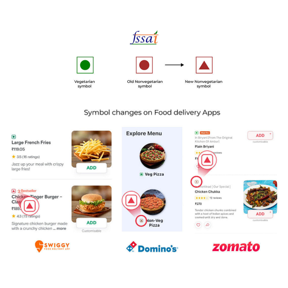
Of course, it’s the food! I hopped into Zomato, Swiggy, and Dominos apps to see if there were any special offers. Nope didn’t get any good deals but I did get to notice a difference in all these apps
What is it?
I can hear you screaming in your mind while reading this,
yes, let’s unfold. It’s the symbol for Non-veg in food products. I couldn’t believe I didn’t notice it before! But its always
“Better now than later”
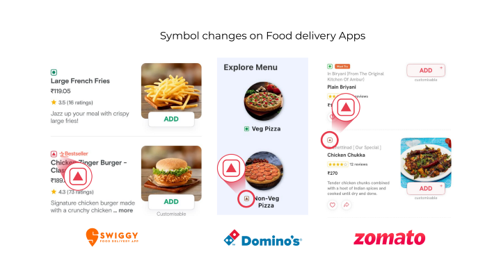
The triangle
We all know India is a diverse country with all the major religions of the world following different diets and eating habits with 40% population avoiding meat completely. This gives the probability of up to 52 crores of the population consuming vegetarian and vegan products in the food market.
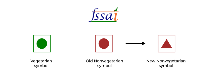
Therefore, FSSAI (Food Safety and Standards Authority of India) statutory body established under the Ministry of Health & Family Welfare, Government of India has renewed the symbol for Non-veg.
I know
Many may think it’s been here for a while! Yes, it is! the purpose of this blog is to present the idea to everyone around the world! This practice of labeling food for Veg and Non-Veg products is not followed everywhere around the world but only a few. Some countries follow to label only vegan & vegetarian products.
It may be small,
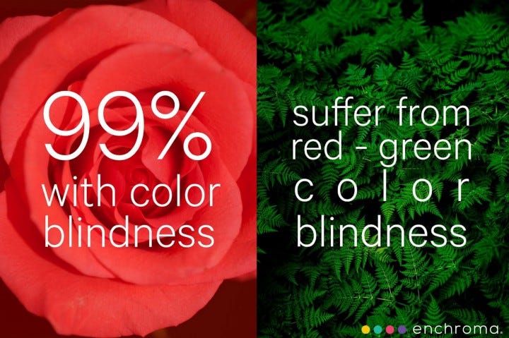
But it is huge for the government body to notice and change the problem faced by the people with regard to India, the Supreme Court in the FTII case quoted According to the expert committee’s report, “…it is estimated that 8% of the male population and less than 1% of the female population have a red and green color deficiency, which is the most common form of color-blindness.”
Many colorblind people believe they are purchasing green logo products but in fact, are purchasing brown logo products due to color blindness. This triangle will aid in quickly determining whether the product is veg or non-veg. Any shape, from a circle to a triangle, will be classified immediately.
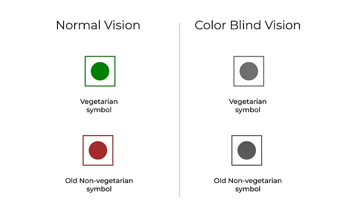
The problem with Green and Red(Red mixed brown) already in color for depicting Vegetarian and Non-vegetarian products is already a problem so to overcome this the symbols have been renewed in all the food products (like chips, cookies, etc.. including all packed foods) and food delivery platforms.
Design must reflect the practicals and aesthetic of business but above all… good design must primarily serve people.
Thomas J. Watson
To wrap things up
The problem solved here is not just a problem faced by people in India but also by people all around the world. A good design must serve all the people, not the majority.
This way of labeling the food leads one less confusion for the user(customer). So I conclude that the method of labeling all types of food products (vegetarian/vegan/meat/fish) should be adapted all over the world.
References
Explained: What is colour blindness, and can you get it later in life?
Behold: The Best Countries to Visit as a Vegan in 2022
Veg and Non-veg symbol on the food products
Food to be labelled as veg or non-veg irrespective of amount of ingredient used: Delhi HC told
