What is Typography?
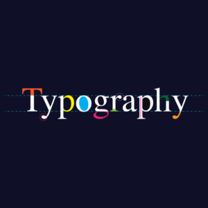
Typography is the skill of arranging written words in a way that is easy to read and looks nice. It includes choosing the right fonts, sizes, and spacing for the text, as well as considering factors like line length and spacing between letters. The goal is to make sure that the text is clear, enjoyable to read, and visually pleasing when it is shown on a screen or in print. Typography plays a crucial role in the design, whether it’s in print or digital media. It can convey mood, tone, and hierarchy and affect how users perceive and interact with a design. A good understanding of typography principles and techniques is essential for any designer looking to create effective and engaging visual communication.
How Important is Typography in UX/UI?
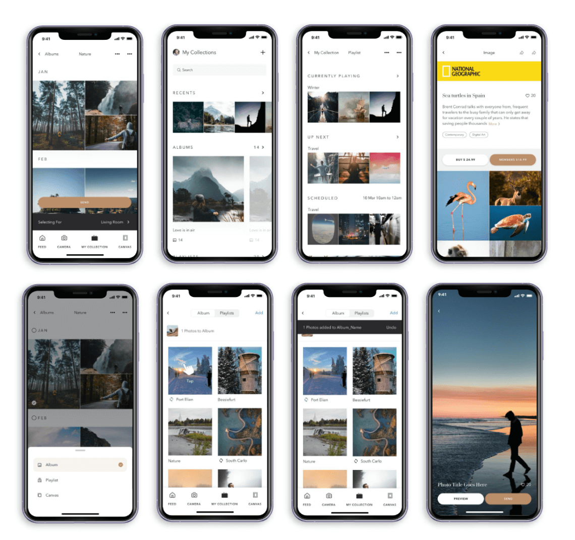
Typography is extremely important in UX/UI design as it directly impacts the readability and usability of the interface. A designer’s typography choices can greatly affect how users interact with the product and the overall user experience.
For instance, if the font size is too small or the typeface is hard to read, users may struggle to understand the content or get frustrated and abandon the interface altogether. On the other hand, if the typography is well-designed and easy to read, it can enhance usability and help users to navigate the interface more effectively.
Moreover, typography also plays a significant role in establishing the brand identity and creating a cohesive visual language throughout the product. It can convey the product’s personality, set the tone, and create a memorable impression on users.
Common Typography Mistakes Made by Designers
Typography mistakes can make the UI design look unprofessional, confusing, or hard to read, which can negatively impact the user experience. Here are some common typography mistakes made by UI designers and how to avoid them:
Poor font choices: Using the wrong typeface or font can make the UI design look cluttered, unappealing, or difficult to read. To avoid this mistake, designers should carefully choose the appropriate typeface and font that suits the design’s purpose and enhances the overall look and feel of the product.
Lack of hierarchy: Failing to establish a clear hierarchy in typography can lead to confusion and frustration for the user. Designers must prioritise the most important information and establish a clear visual hierarchy that guides the user’s eye through the interface.
Inconsistent typography: Inconsistent use of typography can make the UI design look unprofessional and confusing. Designers should ensure that typography is consistent throughout the product, including font choices, font sizes, spacing, and formatting.
Overuse of bold or italics: Overusing bold or italic fonts can make the UI design look cluttered and hard to read. Designers should use bold or italic fonts sparingly to highlight important information, rather than using them excessively.
Poor spacing: Poor spacing can affect the readability of the text and make the UI design look unprofessional. Designers should ensure adequate spacing between letters, lines, and paragraphs to improve the readability of the text.
Tips to Avoid and Overcome Typography Mistakes in UI Design
Understand the purpose of the design: The purpose of the design should guide the typography choices. Designers should choose a typeface and font that fits the brand identity, target audience, and the design’s purpose.
Establish a clear hierarchy: A clear hierarchy helps guide the user’s eye through the interface and makes the design more effective. Designers should prioritize the most important information and use typography to create a clear visual hierarchy.
Maintain consistency: Consistent typography makes the design look professional and enhances the user experience. Designers should maintain consistency in font choices, font sizes, spacing, and formatting throughout the design.
Use bold or italic fonts sparingly: Bold or italic fonts should be used sparingly to highlight important information, rather than being used excessively, which can make the design cluttered and difficult to read.
Ensure proper spacing: Proper spacing between letters, lines, and paragraphs improves the readability of the text and makes the design more appealing. Designers should ensure adequate spacing between typography elements to improve the overall design.
Some Good Typography Tools
Typography tools, such as Adobe Typekit, Google Fonts, or Canva Design, can help designers choose appropriate typefaces, create font combinations, and maintain consistency in typography choices.
Conclusion
In conclusion, typography plays a crucial role in UI design and directly impacts the readability, usability, and overall user experience of a product. Typography mistakes, such as poor font choices, lack of hierarchy, inconsistent typography, overuse of bold or italic fonts, and poor spacing, can make the design look unprofessional, confusing, or hard to read, which can negatively impact the user experience.
To avoid these mistakes, designers should carefully choose appropriate typefaces, establish a clear hierarchy, maintain consistency, use bold or italic fonts sparingly, ensure proper spacing, and use typography tools. By following these tips, designers can create effective, visually appealing, and user-friendly UI designs that enhance the user experience.
As a UI designer, understanding the importance of typography and how to avoid typography mistakes can greatly improve the effectiveness of your design and create a positive user experience.
References
https://www.smashingmagazine.com/category/typography/
https://medium.com/codex/emotions-of-typography-in-ui-design-923efb3f3393
https://fonts.adobe.com/?ref=tk.com
https://www.webdesignerdepot.com/2023/04/15-best-new-fonts-april-2023/


