Problem
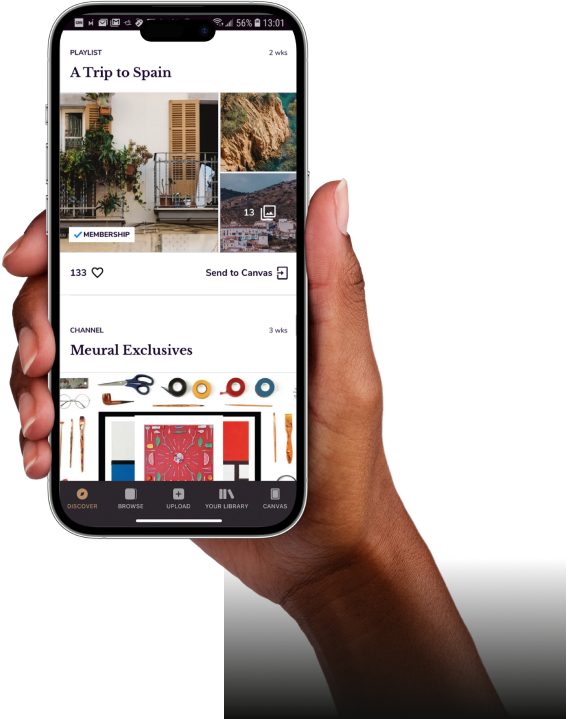
Meural canvas is usually regulated by the Meural companion app. The idea was to socialize the canvas by adding new features, refreshing the aesthetics, and eliminating the UX inefficiencies.
- The current app’s interface had too much clutter and multiple design elements competed to attract the user's attention simultaneously.
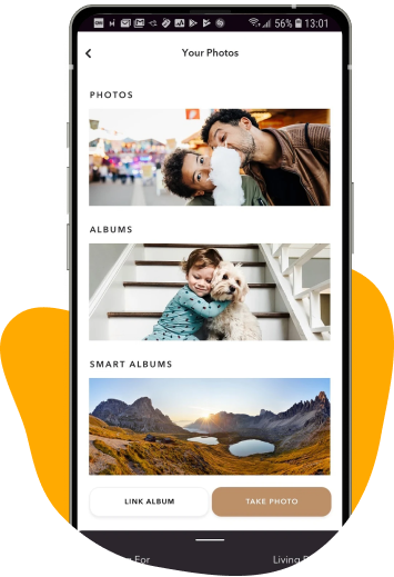
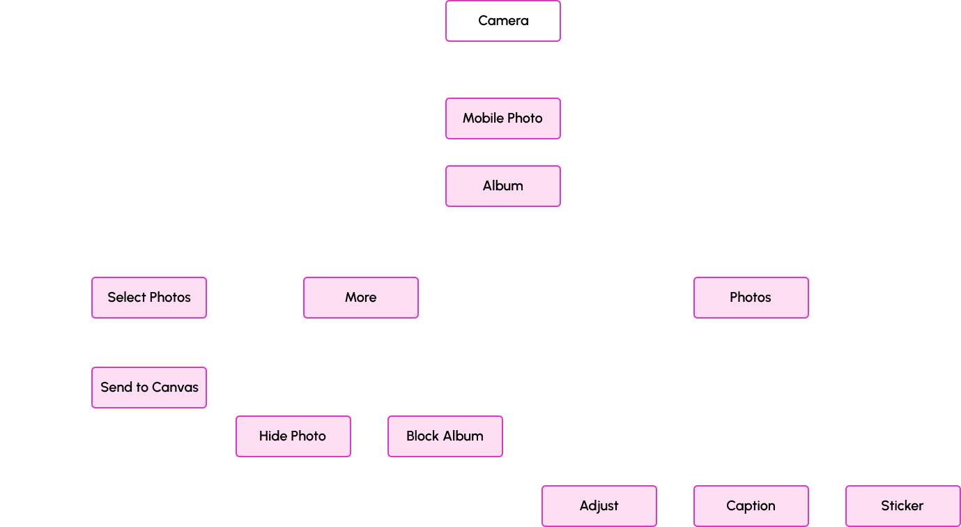
- One of the key functionalities of the app that lets users send photos from the phone to display over the canvas was a bit complex.
- There was no clear distinction between what’s free & what’s paid stuff. This has irked the Meural users for a long time.
- There were external links opening within the app which caused confusion & frustration, tappable elements didn’t seem so.
Solution
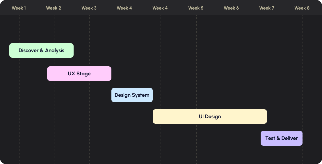
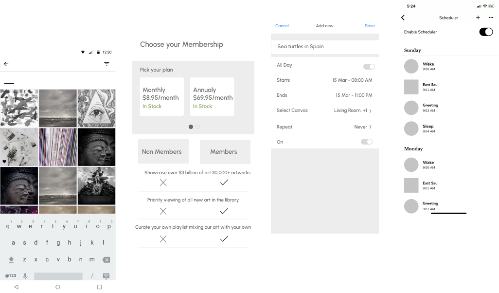
Galaxy started with the basics and did a thorough heuristic evaluation of the existing Meural app. We used the “How Might We” exercise to look for solutions to problems discovered, and then moved on to creating wireframes as per the user stories.
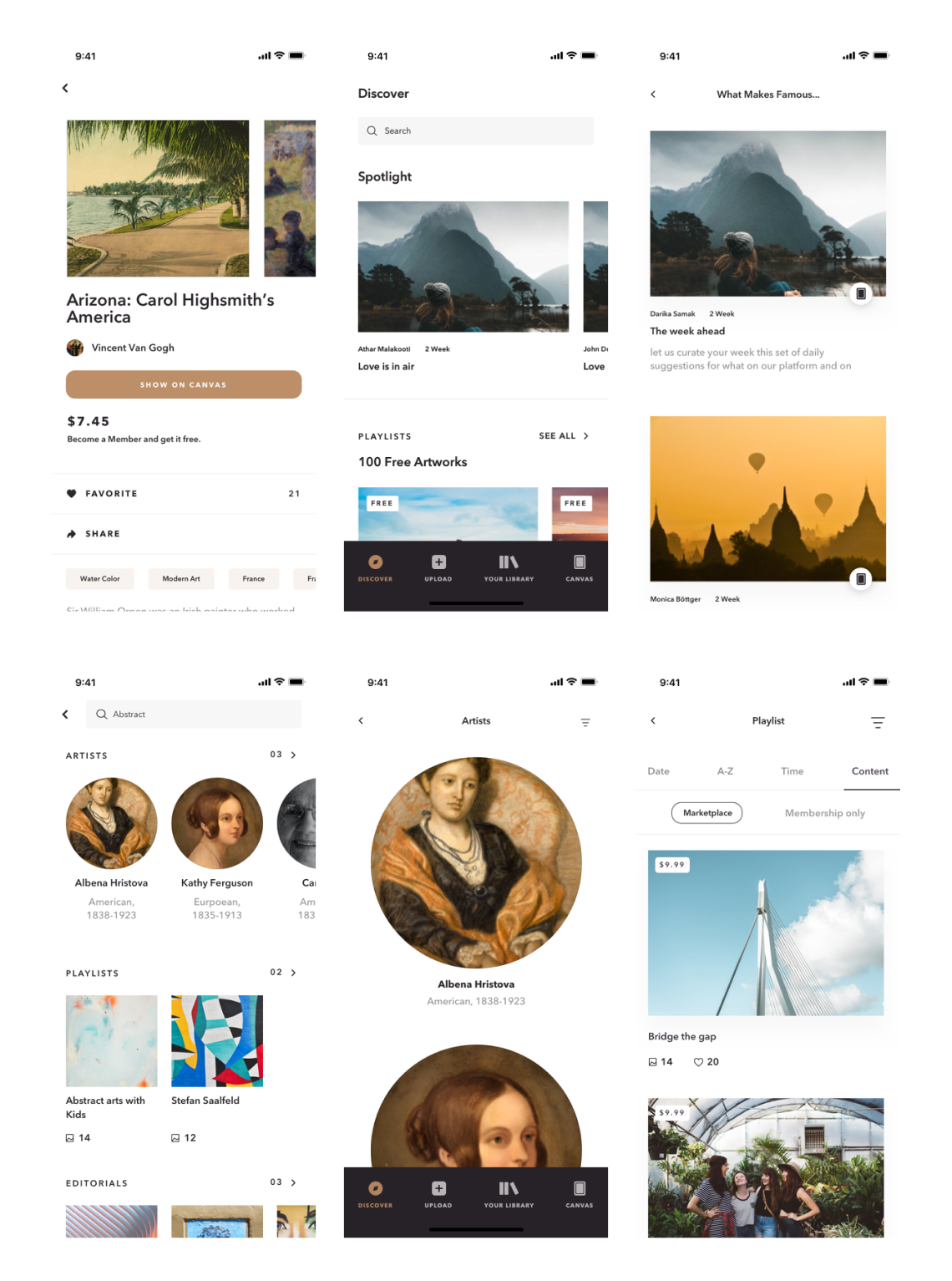
In the ideation stage, we carefully ruminated over the placement of each & every design element over all the screens to reduce existing design clutter. By the end of the exercise, we were left with wireframes that transitioned into a simple, aesthetic UI for the app.
Feature integrations - The 'socializing feature' that lets users add peers into playlists is designed effortless and stimulating, thereby motivating users to perform the intended action. Meural app would now allow users to censor content, easily personalize things, and more.
Galaxy eliminated the other UX issues and simplified the app, providing users with a rich experience overall.

