Empty state ensures smoothness of the experience, though they are the most overlooked aspect of UX design. But knowing what they are and how to use them correctly in our UX process can help us yield more significant business benefits and a better user experience.
What is an Empty State?
Empty states are moments in the user journey where there is no data to be displayed to the user. They are most commonly seen when the first time a user interacts with a product or page but also can be used when data has been deleted or is unavailable. Thus, empty states are the screens in the UI that are not yet filled with information. It is very important to understand that the empty state has a high priority in the UX design process.
What does a basic empty state look like?
Each empty state consists of certain parts:
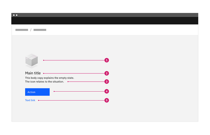
Structure of an empty state text
- Image: An image or illustration that is relevant to the situation when the empty state has occurred. The image here can be non-interactive.
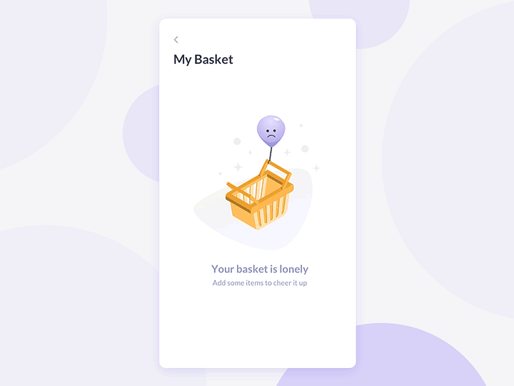
- Title: A short and simple explanation of the empty state that all users should easily understand. Eg., If you click on the cart icon which does not have any items added at the moment, it should display a message with the title “Your cart is empty” or “No search results found” or “Your basket is lonely” as shown in the sample image above.
- Body: Explaining clearly the next action to populate the space. We may also explain why the space is empty and include the benefit of taking this step. For instance, taking the examples stated in the section above, after writing the title “Your cart is empty” we can add a body text “Shop to add items in your cart” to guide the user what they can do next. Another such example is, “ No search results found. Here’s what you can try instead.”
Here are three options of body text for explaining the primary action/ title of the empty state message:
- Directing the user to a primary action button.
- Include a primary action link.
- Directing the user to the UI element. This helps in teaching or guiding the user about where those elements are, what actions they can perform and how?
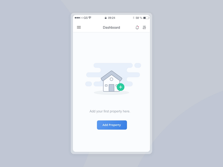
- Primary action — button or link in copy (optional): A call to action (CTA) button can be added to perform the primary action as referenced in the body copy of the empty state message.
- Secondary call to action (optional): If there is a secondary action, such as a reference to a document for further reading, include it as a link below the design. ( check out:- Carbon Design
Importance of empty states
Empty states are a great way to communicate with users in unique situations when there is no data to display and help them smoothly navigate the website or app. As in the absence of empty states, users might feel lost or unattended on a screen within an app or website or get the feeling of hitting a dead-end. Empty states are a way of giving users a well-rounded experience where they feel assisted and guided at crucial journey points within an interface.
The empty state helps in:
- Guiding users through emptiness: The user must know what’s going on, and more important is that they need to understand our product is not useless, and they can keep using it.
- Guiding to a better next step: Getting closer to a conversion simply by showing the user a different choice that will guide them to the next step is a great way to utilize an empty state for the company’s good.
Questions to ask yourself during the design process
During the design process, we must ask certain questions to ourselves which will help us to come up with the best user experience for our users.
- What will the pages, titles, and side panels look like without content?
- What are all of the steps a user can take to solve the situation?
- Is there any valuable content that might be used to guide the user?
- How can we turn this situation into something that is engaging and helpful?
Types of Empty States
Now let’s see some of the common types of empty states a user may encounter while using a product.
- First Use- Such an empty state occurs with a new product or service when the user is using it for the first time and there is no activity or information to show.
- User cleared- Occurs when users complete an action such as clearing inbox or task list and the result is an empty state.

- Errors — These occur when something goes wrong, or when there are issues such as a mobile phone going offline due to network problems.

- No results/ No data — Occurs when there is nothing to show when a user searches for something. This particular case is for when the database has no data or information to show to the user when they enter a search or query. ( For more information on this, check out:- Empty state)

Tips & guidelines for empty states
- The headline/title of the empty state message should start with a verb. Use a friendly voice and tone.
- Body text should be short and informative, telling the user what is happening, and keeping the tone consistent.
- When writing a CTA, we must consider the user’s most likely next best action.
- Illustrations are optional, but they are a great way to add a touch of fun and visual interest while helping users understand their situation.

