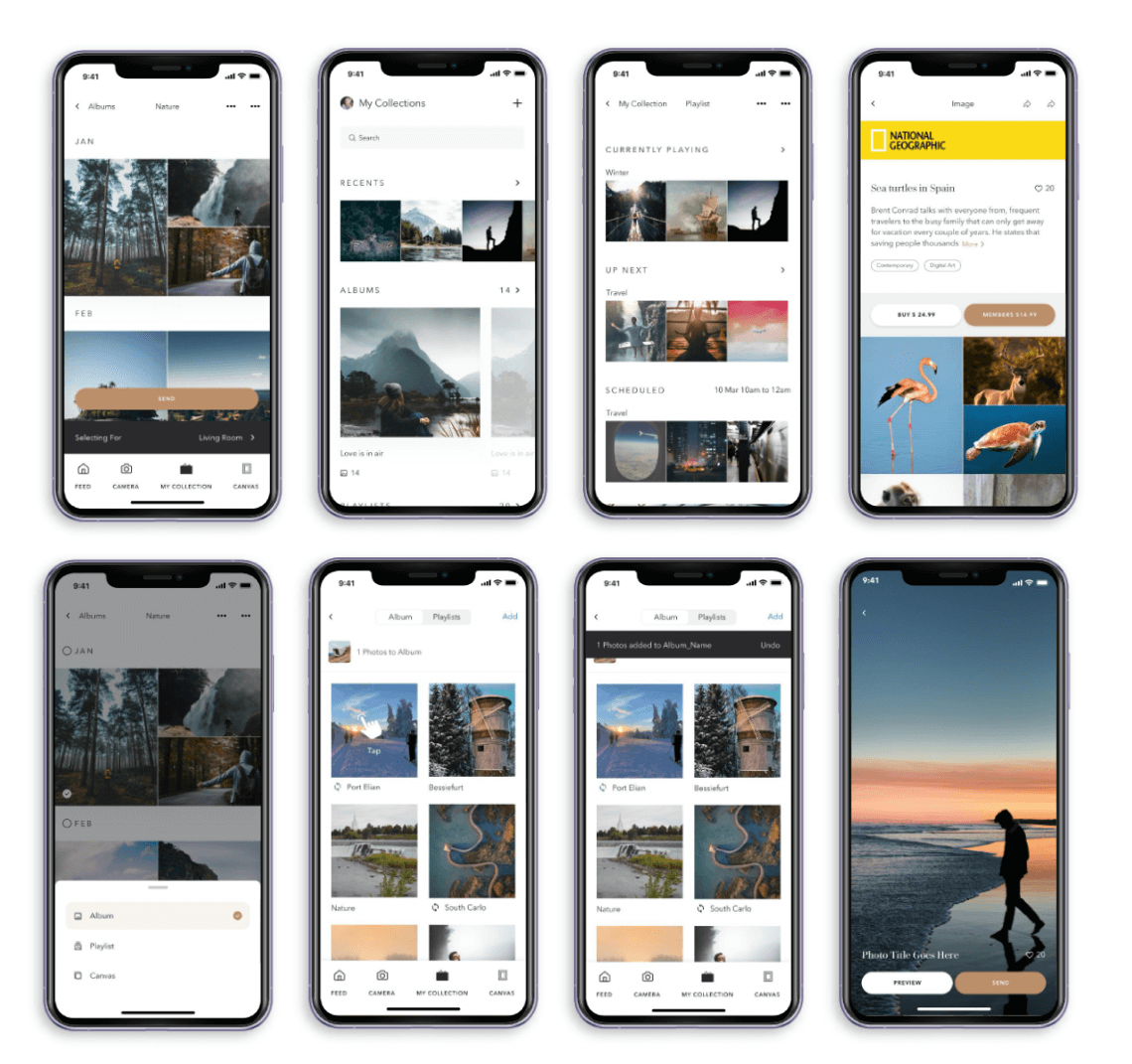
What makes you click on a button on the website you’re browsing or how compelled do you feel to add a product to the cart? In every interaction you make with a digital interface, UX design and psychology are connected and in play but not very obvious to the users.

Have you ever wondered why is it important for us to involve psychology in UX design?
The answer to this is very simple, that’s because humans are pretty complicated.
Humans are so unique in every way that I wonder how a tech company makes us use their products and applications? They do it by influencing one very common thing. That is, using our three out of five senses i.e, eyesight, touch, and hearing. Not all five senses because taste and smell would not influence users in the context of technology and would be weird even if it was possible.
These senses are used to influence users to make decisions. Consider these points to understand this better:
- The buttons and text that you see on screen carry different visual perspectives.
- The vibrations and effects you feel when you click on something or receive notifications.
- The sound that you hear when you receive messages or notifications.
4 psychological principles that’ll change the way you design
- Zeigarnik Effect
- Hick’s Law (Hick-Hyman Law)
- Serial Position Effect
- The Von Restorff Effect
1. Zeigarnik Effect
People remember incomplete or interrupted tasks better than completed tasks.
Here are two stories to understand this principle better:
- Long ago in 1920, a Lithuanian-Soviet psychologist Bluma Zeigarnik conducted research on memory. She found that uncompleted tasks are easier to remember, than successful ones, because humans keep feeling tension and pressure to finish them.
- Another psychologist, Kurt Lewin, the creator of the Field theory, explored how the Zeigarnik effect works in real life. He observed how a waiter worked with his orders and found out that the waiter remembered unpaid orders much better than those that people have paid for.
The Zeigarnik effect can be used to create deeper user engagement.
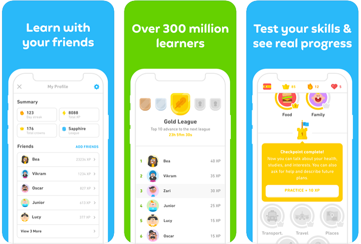
Example: Gamification — a common practice to motivate users to go deeper into any process of the product using points, credits, reward system, starting challenges, setting goals, and encouraging users to publicize their achievements have always created better user engagement. Progress bars also help in increasing the likelihood of users completing tasks.
Completeness meters have been a part of various social media, job portals, and check-out forms. This works for fitness apps, educational apps like Duolingo, social media apps like Instagram or Tik Tok, and many more.
2. Hick’s Law
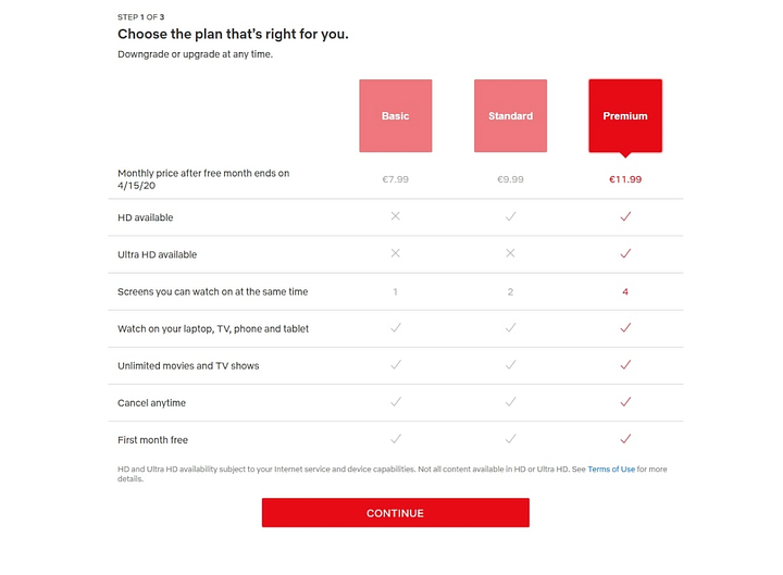
Also known as Hick-Hyman Law. It says the time it takes for a user to make a decision depends on the number of options that are available to them, i.e, if the number of options increases, so does the time to make a decision.
Based on this law, to improve your design, you should
- Break down complex tasks into smaller, doable steps to simplify the choices for the user.
- Avoid overwhelming users with too many choices and highlight recommended options.
- Use progressive onboarding to minimize cognitive load because users browse your website with a specific goal in mind.
- Minimize the distractions by removing unnecessary links, images, tags, and buttons from pages to allow users to find what they need as soon as possible.
- Shorten long lists and reduce the number of options where possible. In cases where long lists are necessary, we should limit the number of options to view at a single time to make scanning of the content easier and faster.

3. Serial Position Effect
The users tend to remember the first and the last item in any given series.
To improve your design, you should:
- Position the key actions on the far left and right within elements such as navigation to increase memorization.
- Emphasize the most important information for the user at the beginning and the end.
Example: The bottom navigation of any mobile app puts the most essential navigation items on the left and right-hand sides because the thumb reaches the bottom of the screen and it’s using the serial position effect and making sure the most important things are in your memory and within reach.

4. The Von Restorff Effect
Also known as the Isolation Effect. It states that:
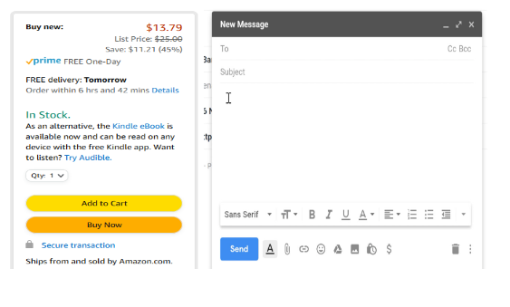
If there is a multiple of the same kind of item and then there is one unique item it’s most likely to be remembered.
It’s just a fancy way of saying one of these things is not like the other.
To improve the design, you should:
- Highlight the key actions that we want users to perform.
- Scale, shape, white space, or movement could be also utilized to help you highlight selected elements or contents from surrounding information.

Conclusion
Human beings are complicated, we always make associations between what we think and what we see. Psychological principles and concepts can help you design with the human factor in mind.
Understanding the psychology used behind any design is very important because psychology plays a huge part in the user experience of any app or website. Understanding how a user’s mind remembers something, and how they interact with things, can help designers to design great experiences.
Above were just a few pieces of the psychological principles that we discuss, in reality, there are plenty of in-depth concepts designers must know.
I have added a few resource links that I found helpful and have some in-depth knowledge.
