Space is nothing but an empty area. But even this empty area is very useful to organize the data and define hierarchy and structure in a web or mobile UI design when used correctly. In design, it is the space between layouts, paragraphs, UI elements, and so on.
Importance of white space in design
White space in design not only boosts the user interface but also the user experience of the design. It plays a very important role in making the design neat, clean, and easy to understand.
Spacing helps to:
- Balance the design
- Organize the data
- Define the hierarchy and structure
- Increase the readability
- Group the information as well as separate the information.
Standard principles for spacing
There’s a theory in cognitive psychology called “The Gestalt principles of design” in which there are some simple yet effective spacing principles that help in using the white spaces in a design to communicate with the users better.
Proximity: It states that the things that are close to each other appear to be more related than things that are spaced farther apart. Thus, it is known as Gestalt’s principle of proximity.

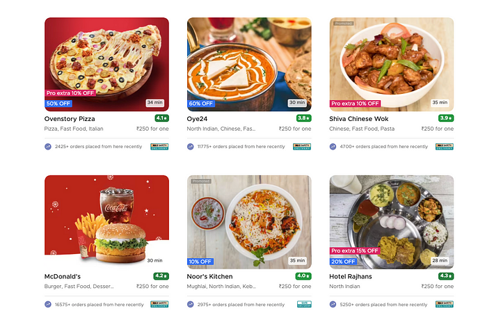
In this example from Zomato, the nearness of each image and its corresponding
text communicate that they’re related to one another.
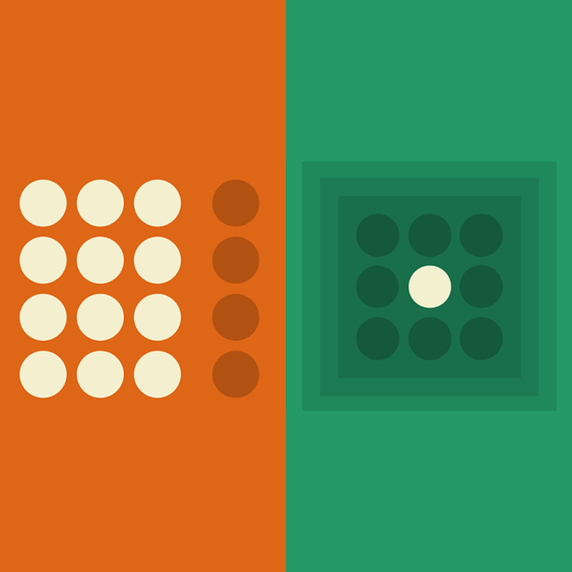
Common Region: It is highly related to proximity. This principle states that when objects are located within the same closed region, we perceive them as being grouped together.


In this example from Ola, the common region principle is used to separate each card
including its photo, title, description, and other details from all the other cards around it.
Set base numbers for consistent spacing
Set up memorable base numbers which you are going to follow for consistent spacing in your design. A 4-based scale is a recommended scale for many reasons. Both iOS and Android use and recommend metrics that are divisible by or multiples of 4 (4, 8, 12, 16, 20, 24, 28, 32, 36, 40, …).

Choosing a scale helps to provide consistent spacing all over the app, which makes it look proper and clean.
Consistent spacing is not only helpful in big layouts but also in small elements like buttons, tabs, etc.
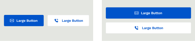
In the above example, consistent margin and padding are used in both buttons, which makes them more clean, usable, and adaptable on different screen sizes.
Let’s see how spacing can change the grouping of elements in individual cards.
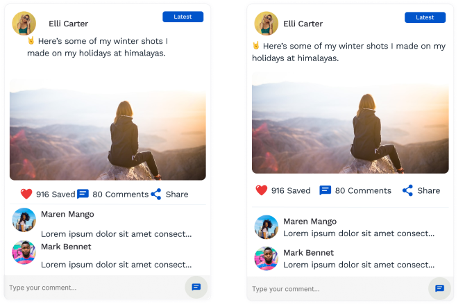
In the first card, improper and inconsistent spacing is used because of which we are unable to see the grouping of elements. For example, it’s hard to differentiate between two comments. It is also hard to tell which icon is used for “Saved” and which icon is for “Share”.
Where in the second card the same things are fixed just with the help of proper spacing.
Conclusion
White space isn’t literally an empty area, it’s a powerful design tool. Maintaining the white space in the design helps to balance the design. With the help of white space, you can group the information as well as separate two pieces of information.
The more you practice, the more you learn. 🙂