Some of you might be familiar with UX Writing, while some must have heard it for the first time. In this article, we will be exploring UX writing and how it made products successful and popular.
What is UX Writing?
A UX writer has to develop the content that guides users through a digital product, often known as microcopy. Microcopy is an essential component of a successful UX design. It displays the signposts that guide users through an app and help them do the work at hand with ease and without stumbling blocks.
Okay! Instead of getting all theoretical, let’s make this fun and see some real examples of brands who leverage UX writing to enhance the overall experience of their product.
Let’s get started!
#1 Spotify
Here, the copy of the “After” screen feels like a natural part of the product, but the “Before” copy is just too wordy and imprecise. The improved copy is straightforward, intuitive, and focused on the user’s advantage. It also attempts to evoke emotions by reminding listeners of the music they love and helping them feel better. A microcopy, however small is an essential component of the design that has a greater impact on the user experience.
#2 Google
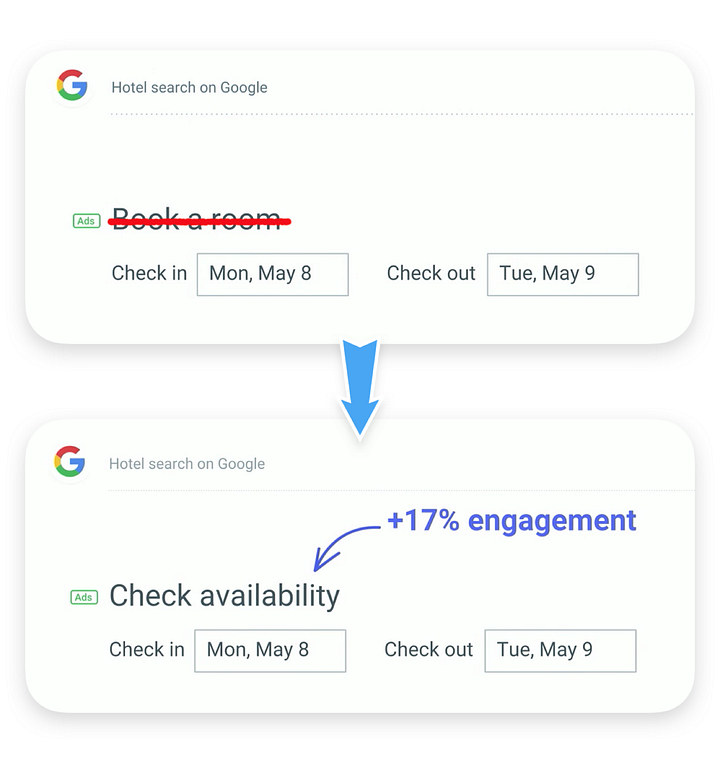
Google earlier used the text Book a room on its hotel booking page, but soon modified the copy as they realized something was about the copy was not right.
“We realized that it was far too committal at this level in the decision-making process,” says Stanphill from Google. “So we changed it to Check availability, and we discovered that this met the consumer right where they were in their mentality. They were still looking at rooms and wanted to know what dates were available and what the pricing was for that time period.”
It demonstrates how the capacity to comprehend a user’s emotions and intents in order to develop the appropriate microcopy may impact corporate earnings.
#3 Pixar
Pixar gave an amazing 404 error page where the user never gets irritated with the page. They have given a character from Pixar who is funny, adorable, and expressive, shifting the user’s mood from being disappointed by seeing an error message to feeling a little better and hopeful that the problem will soon resolve. Even the words used i.e., “Awww…Don’t Cry” expresses the emotion of the character as well as the users.
Ways to Improve your UX writing skills
- Understand your users and write for them
- Consider your brand voice
- Don’t underestimate personalization
- Don’t use jargon
- Be careful with humor
Let’s explore each point in detail.
1. Understand your users and write for them
Always write for the screens based on the user’s interest. It should communicate with the people according to their needs and pain points.
2. Consider your brand voice
Your company’s identity is established by your brand voice, which includes the typeface and logo you use to the color scheme used for the brand. Of course, having a simple, consistent, and intuitive brand voice and writing style is essential.
Choose a brand voice that best represents your product, and which is suitable to your target audience’s goals and needs.
3. Don’t underestimate personalization
Personalization is a simple, nearly cost-free technique to enhance conversion rates. It’s critical to program your website to remember a customer’s name and address them by name. Would you buy from a website if they referred to you as a “user” all the time? This is only the tip of the iceberg when it comes to customization.
Make sure that users enter your website or product, they feel welcomed in a personal space. Create a customized user audience instead of naming every user as an individual user, so that you can create a unique user experience for each user of your product. This can sound simple but creates a better impact on product usage.
4. Don’t use jargon
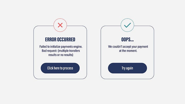
Make sure your UX authoring is aimed at users rather than developers for on-screen communications, this means eliminating jargon. Even if the interface designer understands what an error number or debugging log means, it may not be user-friendly for your intended audience.
Assume you are chatting to someone who is learning to use the internet for the first time, and keep your language basic. The same may be said about industry-specific jargon. Examine these error messages which do you think the average user would find more useful? Think for yourself, what would you find better to understand, and there you have your answer.
5. Be careful with humor
Humor is a pretty personal experience. Whatever some people are finding sarcastic, others could consider it impudent or even unpleasant. When you use humor in your microcopies for apps or websites, consider whether it’s right for your brand or suits your brand identity. Next, try using humor with your customers, similarly to greeting them with their first names. To be able to do so, you must first get the relevant authorization. You may start making jokes when you’ve gained your audience’s faith and trust. Meanwhile, approach with caution.
Closing thoughts
Admittedly, it’s difficult for the freshers to learn and implement the UX writing in a short time, but we can use the trial and error method and learn UX writing by practice. Make sure you keep the above points from the blog in mind while practicing writing your microcopies.
I hope you find my blogs helpful. Follow me for more UX and UI blogs.
Applause for this blog will motivate me to write further. Thanks.
References :
https://www.netguru.com/blog/good-ux-writing-examples
https://www.scoredigital.io/articles/heres-how-ux-writing-can-improve-your-product
https://bootcamp.uxdesign.cc/the-importance-of-ux-writing-in-product-design-5fb60469dc75


