


You might be going around social media and noticing these cool color gradients. They seem to be everywhere, but were they always this popular?
Yes, remember skeuomorphism? Apple implemented it to show similarities between the real world and the digital world. This helped first-time adopters of digital technology to be familiar with the workings of various elements.

We used gradients in the past to give digital objects a 3D look. As people started becoming more familiar with the digital world, it was no longer necessary to keep skeuomorphism. And the world was run over by minimal and flat designs. Gradient design got a comeback when minimalism made everything look the same, to add more character, gradients were introduced again. And it is said that Instagram’s logo redesign in 2016 gave gradients its second wind.

What is a Gradient?
The most common explanation would be color transitions. It is a gradual blending from one color to another, and it isn’t limited to two shades. Here are some of the examples of gradients.
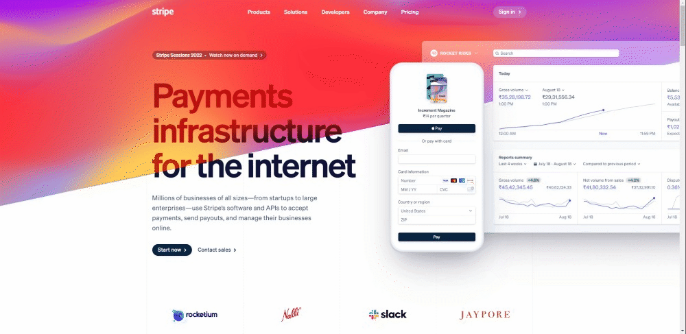
Here you can see how gradients give a depth feel to the cards, background, buttons, and even the route map.

Tinder strengthens its branding using the same gradients for common UI elements. You can notice the same for chips, story highlights, cards, toggles, etc.

Types of gradients
1. Linear gradients
They are one of the traditional gradients moving straight from one side to another. Their angles can be changed, as they can be vertical, horizontal, or at an angle.
Also, this is a great way to show the direction of light to give the design a more natural look.

2. Radial gradients
It is defined by a center point. Multiple color-stop points can be added to define the shape. Also, it is used to show depth in order to show that objects are in a 3D space.
Here in this example, the radial gradient acts like a spotlight behind the Pepsi can, making it stand out from the background. It also helps the text stand out due to the dark background.

3. Fluid gradients
It’s cool, unique, and new! This is a mesh-like gradient with color-stops all over the composition.
There are a lot of colors here, but it does not overwhelm the user. It guides our eye to the application and content. It guides the flow of our eyes similar to a river.
4. Conic gradients
A Conic/Angular gradient is similar to a radial gradient, with color transitions rotated around a center point. But in this case, the color-stops are on the outer edge of the circle created.

Gradient design tips
Designing cool gradients is one of the best ways to outshine your competition. It helps you stand out from the flat and minimal designs out there. Here are a few tips and tricks to ace your gradient game.
1. Refer to nature for inspiration

2. Find analogous colors

Going to the color wheel, you would notice that some colors just do not fit together. It is always better to follow patterns that exist in nature. It’s always better to use analogous colors or shades of the same color.
Also, make sure to create smooth transitions. Ideally, the user shouldn’t be able to notice the separation. You might need to add a few more color-stops for making the gradients smoother.
You can also use gradients to direct the eye to a certain part of the screen. And always take into consideration color contrast when using other elements on your gradients.
Also, follow the direction of light, if a gradient is vertical, make sure the lighter color is on the top to make it look natural.
Conclusion
Observing nature to find amazing gradients is one of the quickest ways to find inspiration. You might have noticed sunsets, and how the orange sunlight transitions into blue and even pink hues. I would like to add that it is one of my favorite gradients.
There are also plenty of websites that have a plethora of easy-to-use gradients. I would certainly recommend checking out https://uigradients.com/ for some great linear gradients.
And the second website https://meshgradient.com/ is one of the best places to create fluid gradients. You can add multiple stops and move around all the points to design amazing results.


