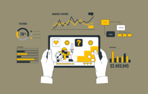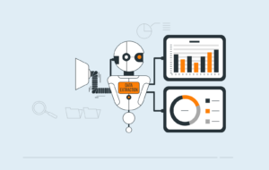
In today’s digital landscape, data analytics platforms are crucial for businesses to make informed decisions. These platforms process vast amounts of raw data into actionable insights. However, the effectiveness of these tools heavily depends on their user experience (UX) design. A well-designed analytics platform not only presents data accurately but also ensures users can easily interpret and act upon it.
The Critical Intersection of UX Design and Data Analytics
“Data tells a story, but design ensures it’s heard and understood.”
– Mike Monteiro
The relationship between UX design and data analytics is fundamental to business intelligence. Even the most sophisticated analytics platform can fail to deliver value if users struggle to navigate its interface or interpret its outputs. Here’s why UX design is essential:
Cognitive processing: The human brain processes visual information 60,000 times faster than text. Well-designed interfaces leverage this by presenting data in visually intuitive formats.
Decision speed: Organizations using analytics platforms with superior UX design report 74% faster decision-making processes compared to those using poorly designed interfaces.
User adoption: Platforms with intuitive UX design see 86% higher user adoption rates, leading to better ROI on analytics investments.
Impact of Poor UX Design on Analytics Platforms
Understanding the consequences of poor UX design helps emphasize the importance of getting it right:
Quantifiable Impacts
- 68% of users abandon platforms with poor UX design
- 70% of analytics projects fail due to poor user adoption
- 88% of users are less likely to return after a bad experience
Qualitative Impacts
- Decreased trust in data accuracy
- Reduced team collaboration
- Missed insights and opportunities
How Good UX Improves Data Representation and Insight Gathering
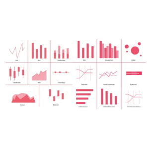
1. Intelligent Data Visualization
Effective UX in data visualization transforms raw data into actionable insights by presenting it in an intuitive, interactive format. Dynamic tools empower users to explore data seamlessly, uncover trends, and focus on what matters most.
Interactive dashboards: Tableau’s success stems from its ability to create dynamic visualizations where users can drill down from high-level trends to granular details with a simple click.
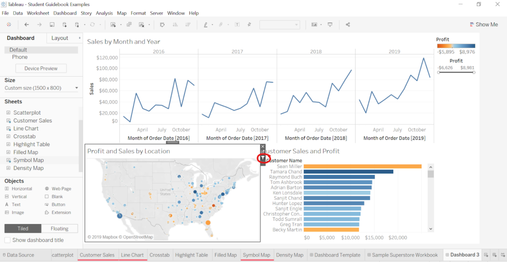
Source: The Tableau Student Guide
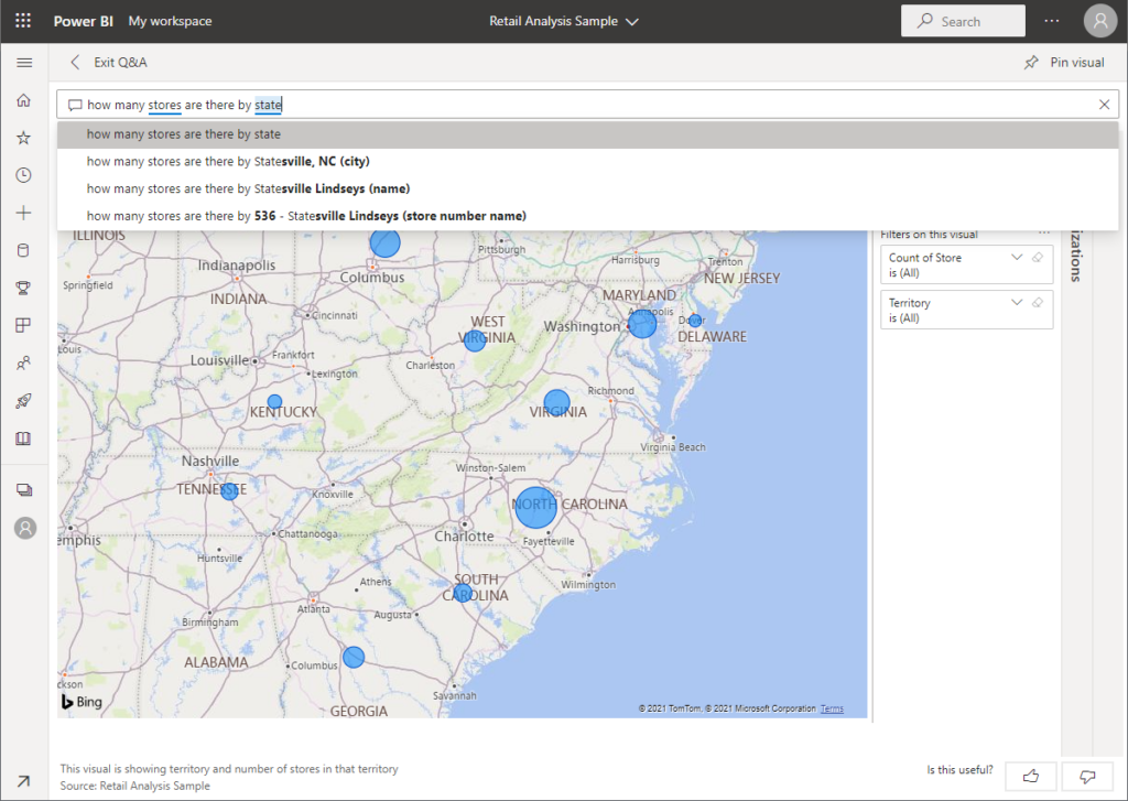
Context-aware charts: Power BI’s smart visualization suggestions analyze your data type and automatically recommend the most effective chart types, such as using heat maps for geographical data or scatter plots for correlation analysis.
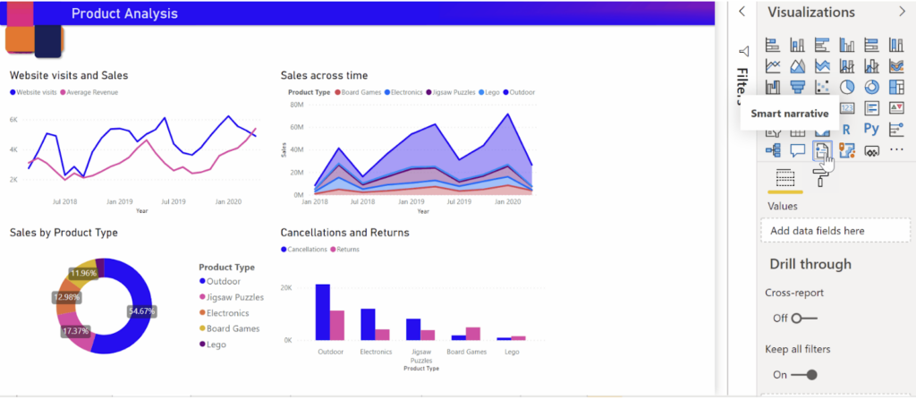
Source: Smart Narrative – Microsoft
Its Smart Narrative feature enhances data storytelling by generating plain-language summaries of key insights directly from your dataset. It highlights trends, outliers, and metrics like growth percentages.
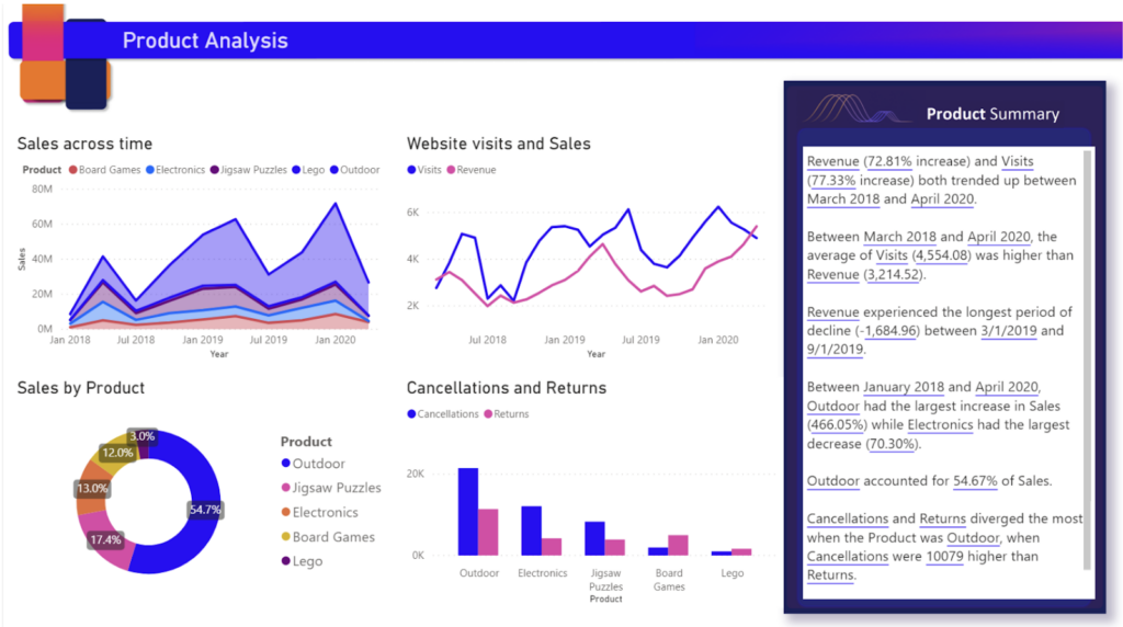
Source: Smart Narrative – Microsoft
Such features save users’ time, improve accessibility for non-technical users, and provide actionable insights, making data visualization intuitive and decision-making faster.
2. Intuitive Navigation and Information Architecture
Well-designed navigation structures and organized layouts simplify accessing and understanding data. By clearly presenting relevant metrics, users can effortlessly move between overviews and detailed insights.
Hierarchical navigation: Salesforce analytics implements a hierarchical navigation structure where users can move from company-wide metrics to team-specific KPIs through logical breadcrumb trails and clear categorical organization.
The breadcrumb shows the initial location where the item was accessed (1). Following that is the item type (2). The open dashboard displays the icon (3), type (4), and saved name (5).
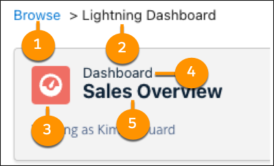
Source: Salesforce Analytics Help
Custom views: Allows different user roles (executives, analysts, sales teams) to access personalized dashboards showing relevant metrics without overwhelming them with unnecessary data.
3. Progressive Disclosure of Information
This design principle focuses on revealing information gradually, starting with high-level metrics and allowing deeper exploration as needed. It ensures dashboards remain clean, focused, and free from unnecessary complexity.
Layered information: Google Analytics implements this through its overview dashboards that show top-level metrics with the ability to expand into detailed reports.
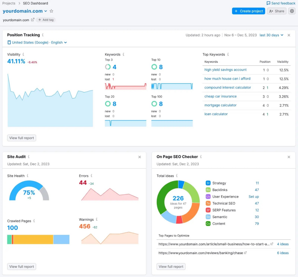
Source: Semrush Blog
Guided analysis: Microsoft Power BI’s Q&A feature starts with basic visualizations and progressively reveals more complex insights based on natural language queries.
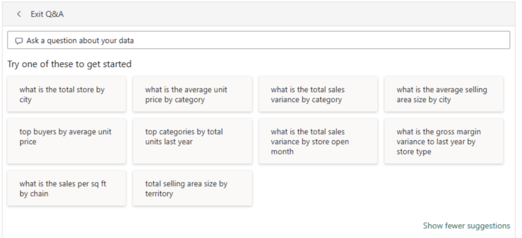
Source: Microsoft Learn
4. Interactive Data Exploration Tools
Interactive tools enhance the user experience by enabling detailed exploration and comparison of data. They allow users to filter, adjust, and analyze datasets dynamically, promoting precision and engagement.
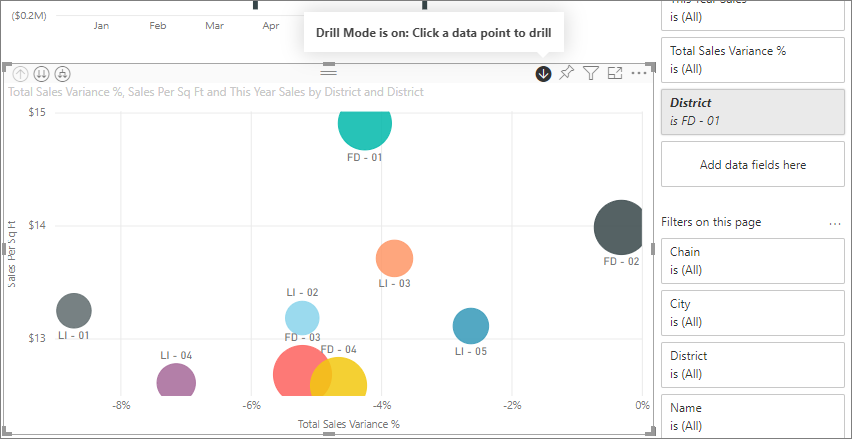
Filter controls: Advanced filtering options that allow users to isolate specific data segments while maintaining the context of the broader dataset. Power BI includes advanced filters like Include/Exclude Filters, Drill-Down Filters, Cross-Drill Filters, Drillthrough and Pass-Through Filters. These tools enable detailed data exploration, cross-visual insights, and dynamic filtering, ensuring flexibility and precision for an intuitive user experience.
Source: Microsoft Learn
Cross-reference capabilities: Google Analytics dashboards enable users to compare multiple metrics simultaneously, providing a comprehensive view of data performance.
Source: Whatagraph.com
Case Study: Revamping the MSI Application for Better Usability
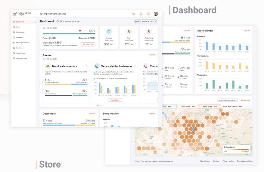
Challenge
Galaxy’s design team collaborated with Fiserv to address the usability challenges of their MSI application, a platform designed to help small business owners analyze sales data and customer spending patterns. Despite its rich data capabilities, the platform’s outdated and unintuitive design hampered user engagement and insight discovery.
Solution
The UX redesign focused on:
Hierarchical information architecture
- Created clear pathways from overview to detailed analysis
- Implemented logical grouping of related metrics
Interactive dashboard elements
- Added drill-down capabilities for deeper insight exploration
- Introduced contextual tooltips explaining complex metrics
Responsive design implementation
- Ensured consistent experience across devices
- Optimized for both desktop and mobile viewing
Results
- 45% increase in user engagement
- 60% reduction in time spent searching for specific metrics
- 80% improvement in user satisfaction scores
Read the full case study here: Fiserv MSI UX Revamp
Best Practices for Analytics Platform UX Design
Designing a user-friendly analytics platform requires careful attention to visualization, navigation, performance, and accessibility. By implementing these best practices, you can create a platform that simplifies data exploration, enhances user engagement, and supports informed decision-making for all users.
1. Data visualization principles
- Use appropriate chart types for different data sets
- Maintain consistent color coding for metrics
- Implement clear labeling and legends
2. Navigation and layout
- Create logical groupings of related information
- Provide clear pathways for data exploration
- Include search and filter capabilities
3. Performance and accessibility
- Optimize loading times for large data sets
- Ensure compatibility across devices and browsers
- Follow WCAG guidelines for accessibility
Future Trends in Analytics UX Design
As technology advances and user expectations grow, analytics UX design is transforming to deliver smarter, more personalized experiences. These trends are shaping the future of how users interact with data, enabling faster insights and tailored solutions for diverse needs.
The future of analytics UX design is evolving with new technologies and user expectations:
1. AI-driven insights
- Automated anomaly detection
- Natural language processing for data queries
- Predictive analytics visualization
2. Personalization
- User-specific dashboard configurations
- Role-based access and views
- Custom reporting templates
Conclusion
The success of data analytics platforms hinges on the seamless integration of powerful data processing capabilities with intuitive UX design. Organizations must prioritize both aspects to ensure their analytics investments translate into actionable insights and tangible business value.
By following these best practices and learning from successful implementations, businesses can create analytics platforms that not only process data effectively but also present it in ways that drive informed decision-making across all levels of the organization.