Illustration by Abbey Lossing
Crafting digital conversations that are humane, ethical, inclusive, and thoughtful.
There’s no denying the fact that technology and digitization have proven to be great enablers for humankind. Today, we can do virtually anything with just a click or tap on the screen. We have an app, website, or online service for everything, from entertainment, healthcare, and education to finance.
Technology, as we know it today, has transcended the boundaries of countries, cultures, and economies and brought people together as one big global digital community. As of 2022, there are around 6.6 billion smartphone users, and the number is only going up. Realizing such prevalence of technology in every possible corner of the globe and the extent of worldwide digitization, it is important to think of its overall impact on the people who are using it.
However, this has also led to technology having a stronger influence on people’s minds and moods. It affects our mental states through the kind of experiences we have while interacting with technology.
Why trauma-informed UX?
Considering the importance of technology in today’s time, it is crucial to be mindful of how we design the experiences of digital products and how it impacts the lives of those who are intended to use them. One effective way to do this is by learning about trauma as a major psychological determinant and how it alters the way people perceive the world around them.
So, what is trauma?
“Trauma is a deeply distressing or disturbing experience that affects a person’s long-term mental, physical, social, emotional, or spiritual well-being.” — Garen Staglin, One Mind at Work
A traumatic event can be personal (life-threatening event, death of someone close, illness, etc.) or external such as the pandemic, civil unrest, war, natural calamity, gun violence, racial discrimination, economic downturn, etc. It can have a long-term effect on a person’s psyche and emotional stability that sometimes even results in conditions like PTSD.
Such deep impact of traumatic events on a psychological level has been shown to affect a person’s basic cognitive abilities such as attention, memory, decision-making, planning, and problem-solving. Thus, people with trauma tend to respond to seemingly normal situations differently.
They may face challenges in everyday life such as:
- Feeling unmotivated to start and/or complete a task.
- Getting triggered by tiny things that make them angry or anxious.
- Having difficulty concentrating on a task.
- Being overwhelmed and confused by information overload.
As per research, around 70% of the world’s population has been exposed to trauma at some point in life. Therefore, it becomes our responsibility as UX professionals (writers, designers, and researchers) to empathize with such people, understand their challenges and thoughtfully design solutions that eliminate these obstacles or at least reduce the friction experienced by them while using technology.
One good example of this is how Airbnb developed trauma-informed products during the COVID-19 pandemic — Designing for crisis.
How to make UX writing trauma-informed?
UX writing is a way of communicating with people through digital interfaces. Although it is a passive form of communication, it has the power to make people feel a range of emotions while they interact with a product. For instance, a misleading ad or unclear button can annoy them, reminders can motivate them, too technical error messages can confuse them, success messages can cheer them up and inclusive or personalized onboardings can encourage them.
To make UX writing trauma-informed, the content in microcopies should be written with an aim to reduce the feeling of stress, confusion, and lack of control that might impact one’s ability to take action in critical situations. The right way of communicating information is by making it clear, credible, interactive, and most importantly, human.
6 principles of trauma-informed care
One promising way of making the UX writing processes trauma-informed is by following the 6 principles of trauma-informed care given by the Substance Abuse and Mental Health Services Administration (SAMHSA), USA.
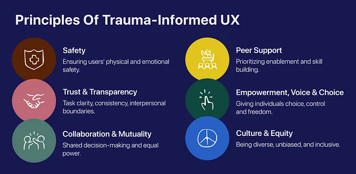
#1 Safety
Providing a sense of safety and prioritizing users’ psychological and physical well-being.
People with a history of trauma prioritize safety over everything. So, we should design products and environments that promote emotional and physical safety. This involves supporting people in making and/or fixing mistakes, ensuring safety and data privacy along with moderating potentially offensive content on apps.
For instance, if someone makes a mistake while completing a task, the system should communicate that in a kind and helpful manner while also offering solutions for getting out of that situation. Some good examples of this are the error messages by Slack and Twitter where they inform the user what’s wrong in a polite way and tell them what they can do to fix it.

Left: Slack’s image upload error state screen; Right: Twitter’s login screen error message.
The “free speech” era that we live in has made the online environment desensitized to how others think and feel. Thoughtful moderation of content that is posted online, especially on social platforms is an absolute necessity in today’s time to curb offensive content.
Twitter has taken an important step in this direction by detecting potentially offensive content and asking users to review and even revise it before posting.
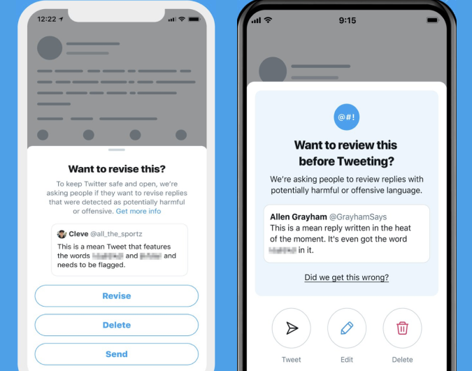
Source: Twitter
#2 Trustworthiness and transparency
Providing full, honest, and accurate information by disclosing what’s happening and what’s next.
Lack of trust is often a byproduct of trauma. These days, every other app or website is asking us for all sorts of permissions and personal information and this can make anyone, be it someone with a history of trauma or not, anxious about their privacy. Such situations are opportunities to be mindful as UX writers.
Digital products should promote a feeling of trust and transparency by being honest about what they want and why they want it. It should not mislead, exploit or manipulate people into doing something they wouldn’t want to do like sharing their details or signing up for a newsletter.
It is extremely important for products to explicitly communicate why they want someone’s information. For instance, Airtable very clearly mentions why it needs you to grant access to share your contacts with it and ensures that it won’t use them without permission.
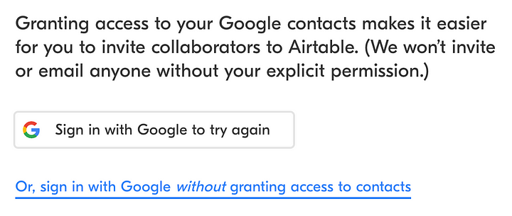
Source: Airtable
Another great example is how Groww, an investment app adds a point to assure the investor that only the SIP amount set by them will be deducted every month, not more. It helps in calming those who might be worried about their money after enabling the auto-pay option in the app.

Source: Groww
One thing to look out for are the cookie-consent popups slyly asking for your permission to access your data. As shown in the example below, a prompt pops up upon opening The Guardian’s website loaded with text. What do we notice first? Positive words like “choice” and “happy”. But, what we miss is the part hidden somewhere in the dense paragraphs that says “we and our partners (over 50) may use your data to improve our service”. Red flag!
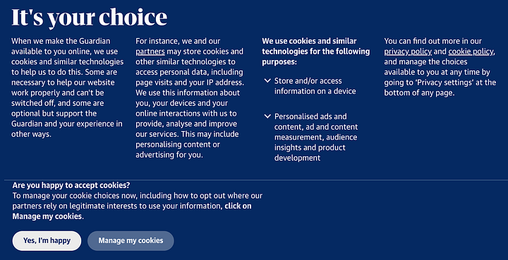
Image 1: Cookie consent popup by The Guardian
Instead, if they choose to be honest, the prompt should say something like what’s shown in image 2.
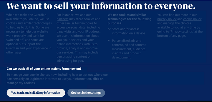
Image 2: An honest copy asking users to sell their information to everyone. (Source: growth.design)
In addition to this, we must avoid dark patterns at all costs as it is the easiest way to make people lose trust in a brand. Dark patterns such as confirmshaming, hidden costs, forced continuity, and disguised ads represent an unethical way to trick people into doing something which is the last thing a person with trauma would want to experience.
#3 Peer support
Prioritizing enablement and extending community support.
A sense of belonging and acceptance in the community brings with it a great deal of healing for people with trauma. Technology can contribute to this by serving as a platform for people to seek help and support from their peers. An app like Unmasked is a great example of giving people a safe place to share their concerns and get support from the community.
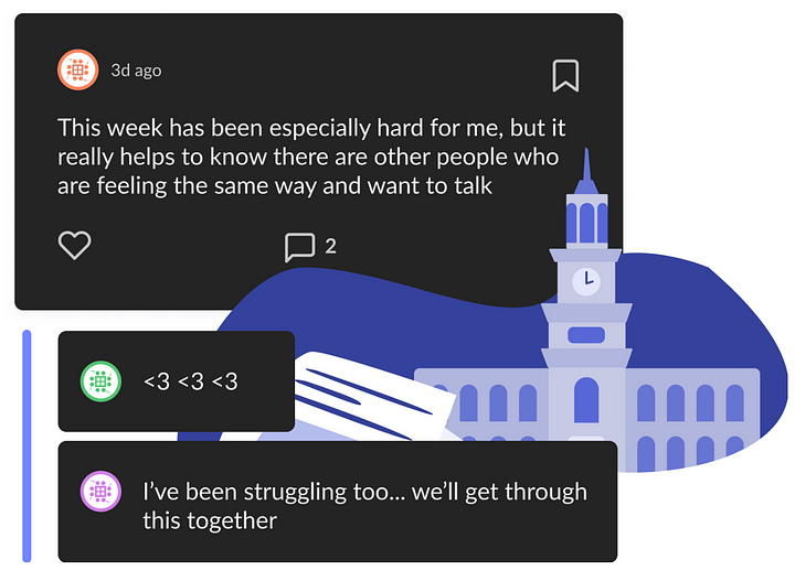
Source: Unmasked
Along with offering such platforms, it is equally important to humanize these conversations and make sure that there’s empathy and sensitivity in the language being used on these apps and websites.
#4 Collaboration and mutuality
Fostering collaboration, meaningful sharing of power, and a sense of equality.
Labeling people having disabilities often make them feel alienated or different from others. The screenshot below shows a commendable effort by Lyft that notifies its passenger about a driver who is hard of hearing and suggests ways to communicate with him. However, the way the driver’s condition has been communicated here is not quite right (calling him deaf) and can be made better by using people-first language. This approach addresses the person first and makes them feel equal in society instead of using their condition to define and label them.

Source: Writing is Designing — adobe.design
Instead, the people-first notification copy would go something like,
“Your Lyft driver is a person who is hard of hearing. Please text instead of calling for better communication. Tap this notification to learn “Hello” or “Thank you” in American Sign Language.”
Collaboration and mutuality are about making everyone feel seen, heard, and valued through the experiences we design and the language we use. Using localized language to communicate with people living in different parts of the world or even different parts of a country goes a long way.

Source: Twitter
Zomato, a food delivery app from India has aced the localization game by sending notifications based on the language spoken in a particular city or state making a special connection with the people.
#5 Empowerment, voice, and choice
Accept and honor an individual’s right to choose and express.
It is extremely important to give individuals the freedom of choice and control over what they do. Trauma often instills a fear of losing control over situations in people. One example of this is how WhatsApp lets the recipient know that the sender has deleted a message. This is enough to make both of them feel anxious. Apps should allow people the freedom to make changes as and when they want without letting the world know.

Source: EDTimes
Furthermore, companies should gracefully allow their customers to opt-out or quit their services when they like without making them feel bad about it. If we think about how Typeform bids its subscriber adieu, we’ll notice a flat tone in the message (refer to image 1).

Image 1: Typeform’s cancelation confirmation message. (Source: growth.design)
Whereas a better way to do it is to use a cheerful tone with a forward-looking attitude that makes the customer feel good about being associated with the brand. This also increases the chances of them returning to use Typeform’s services later.
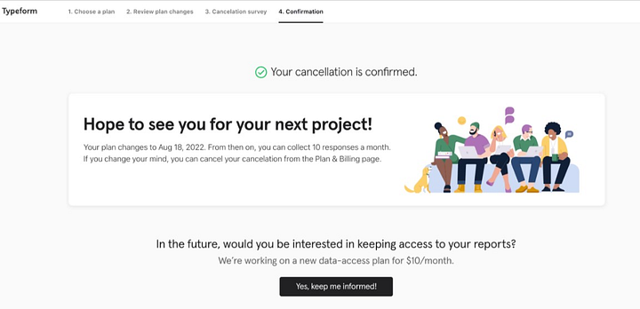
Image 2: Modified copy of Typeform’s cancelation confirmation message. (Source: growth.design)
#6 Cultural, historical, and gender issues
Being inclusive, empathic, unbiased, and diverse.
Everyone wants to be seen and known but nobody wants to be labeled. Unfortunately, that’s what a lot of companies are doing, labeling people for their unique identity, making assumptions or judgments based on societal norms, or worse, being ignorant towards them.
To be truly inclusive, we should let go of our preconceived notions and biases. A couple doesn’t necessarily mean a man and a woman, a mother can be single and/or unmarried, or someone using a fitness app isn’t necessarily overweight. What we need is to have an open mind while designing products for society as a whole. The products should address all sorts of people there are, making them feel seen, heard, and valued.
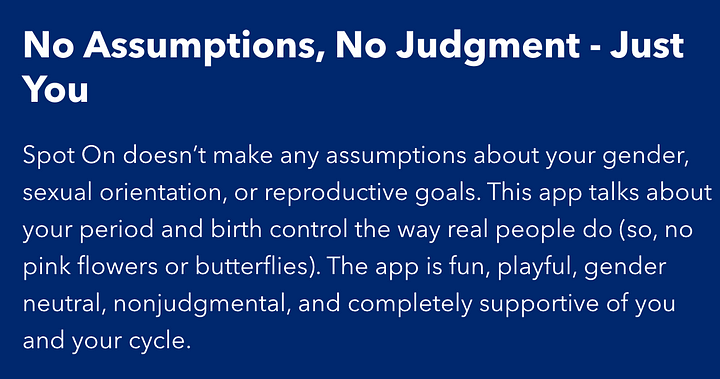
Source: Spot On
A good example of this is the inclusivity shown by dating apps like Bumble and Tinder by giving a thoughtful range of gender options to choose from.
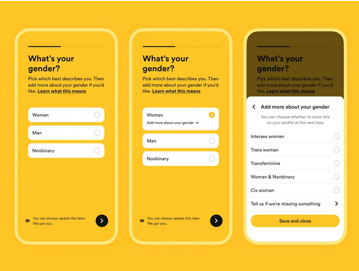
Source: Bumble’s gender options
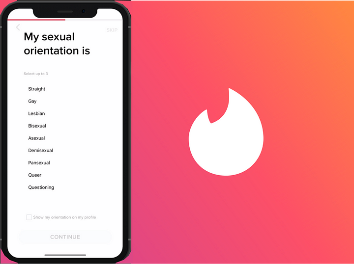
Source: Tinder’s sexual orientation options
Summary
Language plays an important role in designing impactful experiences that makes it an integral part of product design in today’s time. Designing content that acknowledges and addresses the psychological implications of trauma leaves a visceral impact on people. Coupling UX writing practices with the 6 principles of trauma-informed care is an effective way to improve people’s experience with technology by making it more kind, pleasant, and thoughtful.
References and further reads
- SAMHSA’s Concept of Trauma and Guidance for a Trauma-Informed Approach
- The epidemiology of traumatic event exposure worldwide: results from the World Mental Health Survey Consortium.
- Why Global Leaders Must Step Up To Address Trauma Now
- To Build Gentler Technology, Practice Trauma-Informed Design
- Designing for crisis — Airbnb
- Trauma-informed design research
- What is Trauma-informed Design?
- Designing forms for gender diversity and inclusion


